Park Slope Reader
Website redesign for a local publication
Overview
Park Slope Reader came to me seeking a more user-friendly design of their online publication. I took their current website and reworked the content using modern, user-focused design principles after employing research methods such as contextual inquiry, user interviews, and a competitive analysis.
I focused on four main points on their existing website for improvement: the logo, the navigation, the ads, and the articles. Below, I break down each of these sections and how I worked to improve them.
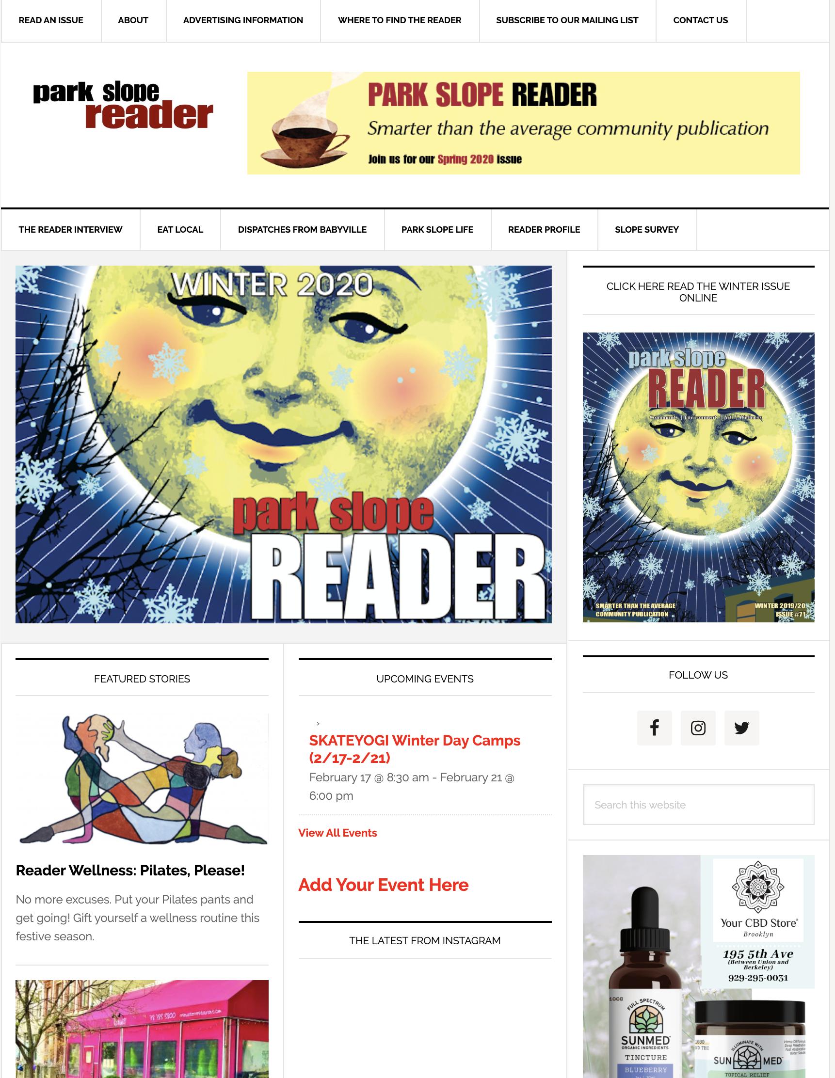
The original Park Slope Reader webpage
Understanding the Client's Needs
My first step was to understand the unique needs of the client. Park Slope Reader is a small, local publication whose online platform is powered by Wordpress. They made it clear that their budget was low, and that they intended to stick to using Wordpress for ease of content management by their team.
Park Slope Reader attracts an older demographic from the Park Slope neighborhood of Brooklyn and keeps itself running on advertisements from local businesses.
The client noted that their main goals with the redesign were usability and ease of upkeep via the Wordpress CMS. They informed me that advertisements could not be lessened or removed from the page, as ads were their main source of income.
User Interviews
To understand the pain points in the original Park Slope Reader website, I interviewed multiple users to understand what areas could be improved. I took notes throughout the interview sessions, and compared key points across users. In analyzing key words from my interviews, I noticed four main areas of the page were the most mentioned: the logo, the navigation, the ads, and the articles.
Logo: Users noted that the Park Slope Reader logo’s positioning on the page did not effectively communicate that they were on the website of Park Slope Reader. The logo was secondary to advertisements both in size and hierarchically on the page.
Navigation: This was perhaps the most-mentioned and biggest pain point for users. The navigation on the original site had poor information architecture, and was separated into three different navigation bars throughout the page.
Ads: Users noted that the placement of advertisements amongst articles on the page was confusing, as it was often impossible to visually distinguish between ads and the articles that they came to the page to read.
Articles: Multiple users mentioned that they sought brief intro sections for articles, giving them a glimpse of what they would be reading before navigating to the full article page of the site.

Competitive Analysis
Before jumping into the design process, I took a look at other small, local publications to see how others approached theses aspects of their pages. Overall, they kept their logos prominent, stuck to one top navigation bar and one bottom navigation bar, and kept articles and advertisements visually separated.
Design
After taking into account everything I learned from my research, this was the wireframe that I presented to the client:
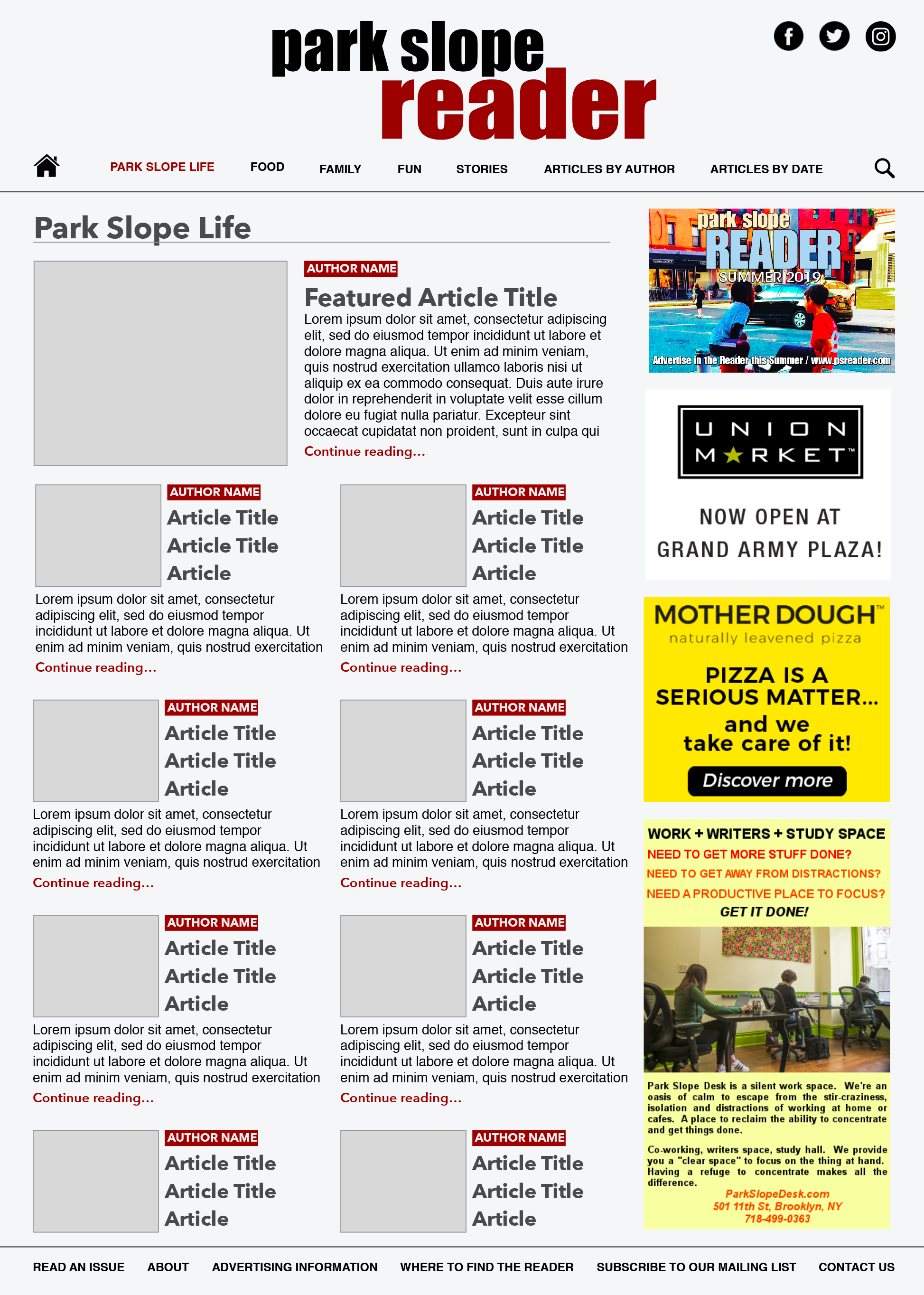
PSR webpage redesign
Logo: I took the logo from the original website and repositioned/resized it to make it the most prominent thing readers see when they first come to the site. Now, readers will know exactly where they are and what type of content they’re going to see when they recognize a logo they know and trust.
Navigation: Instead of the article navigation bar containing links to specific articles, I realized it would be best to categorize all articles and sort them into pages where readers would be able to find the specific type of content they are looking for. Additionally, I added a prominent search icon right at the top, and links to search by both author and by date. I added their social media links into the header, so they are accessible and in the same spot for every page.
The double top navigation bars presented a potential to confuse readers, and so I condensed the navigation as much as possible. On the current site, the “upper” bar contains links to information that would pertain to a very specific audience: one that would seek it out only if they were interested after perusing the rest of the site (example: advertising information). Therefore, I moved these links to the footer, where links like “contact us” and “about” are often listed as secondary navigation on other company websites. This keeps the information on every page, but does not take away from the core content: articles, and a way to quickly to access them.
Ads: Advertisements are necessary for funding any publication, and they do need a place on the PSR page. However, PSR’s content should be more visually accessible than the advertisements. I kept the right-hand sidebar, and dedicated it entirely to advertising. This way, users will be exposed to advertising throughout the website, but will be able to easily discern between the core content and advertising.
Articles: I condensed all major information pertaining to highlighted articles into previews on the main page. Previews now contain an image, author, article title, and a few lines of content. Park Slope Reader really values their author base, and I wanted to feature author names alongside their respective articles.
Testing
I revisited my original interviewees to see if my design changes addressed their previous concerns. The responses were overwhelmingly positive, and all of them said their major concerns were addressed with the redesigns.
Unfortunately, my testing sessions were cut short on this project when Park Slope Reader decided to not move forward with my proposed designs.